
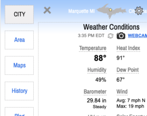
Previously, if you wished to navigate the website in a mobile device you needed to go (back) up to the top left navigation menu. As of today, if you have scrolled to the bottom of the page, you can simply access the navigation in the footer. This has always been the case for those using PCs & Macs.
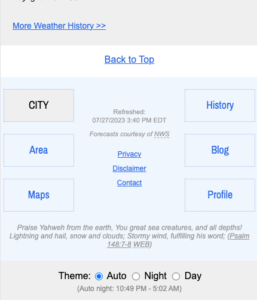
I had struggled to preserve the navigation in smaller viewports without it appearing cramped in that space… until now. I will leave the “Back to Top” links in place for those who want a quick way to start over from the top of the page.
Also I have added a light blue background color to distinguish this section from surrounding content. In night mode, the footer will turn to a deep navy.
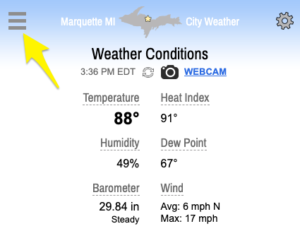
As always, the site is completely responsive which means you can view it on any modern device with the screen size/orientation of your choice. You can even put it in a small browser window when using a computer alongside your other app(s). Home page conditions will update every minute by default and the entire page will refresh every 10 minutes.
I invite you to make full use of the site. Each page is a collection of freely-available, unique resources not found in one space elsewhere.
As it stands we have decent site engagement. That said, plenty of folks — even longtime regular users — have never left the home page. I assure you, we don’t put filler pages on the site. It’s all useful!